⟵
Similarweb, November 2018
Pricing and Packaging Redesigned
This is how redesigning our pricing page led to 16% uplift in contact us and 70% uplift of scheduling meetings.
Background
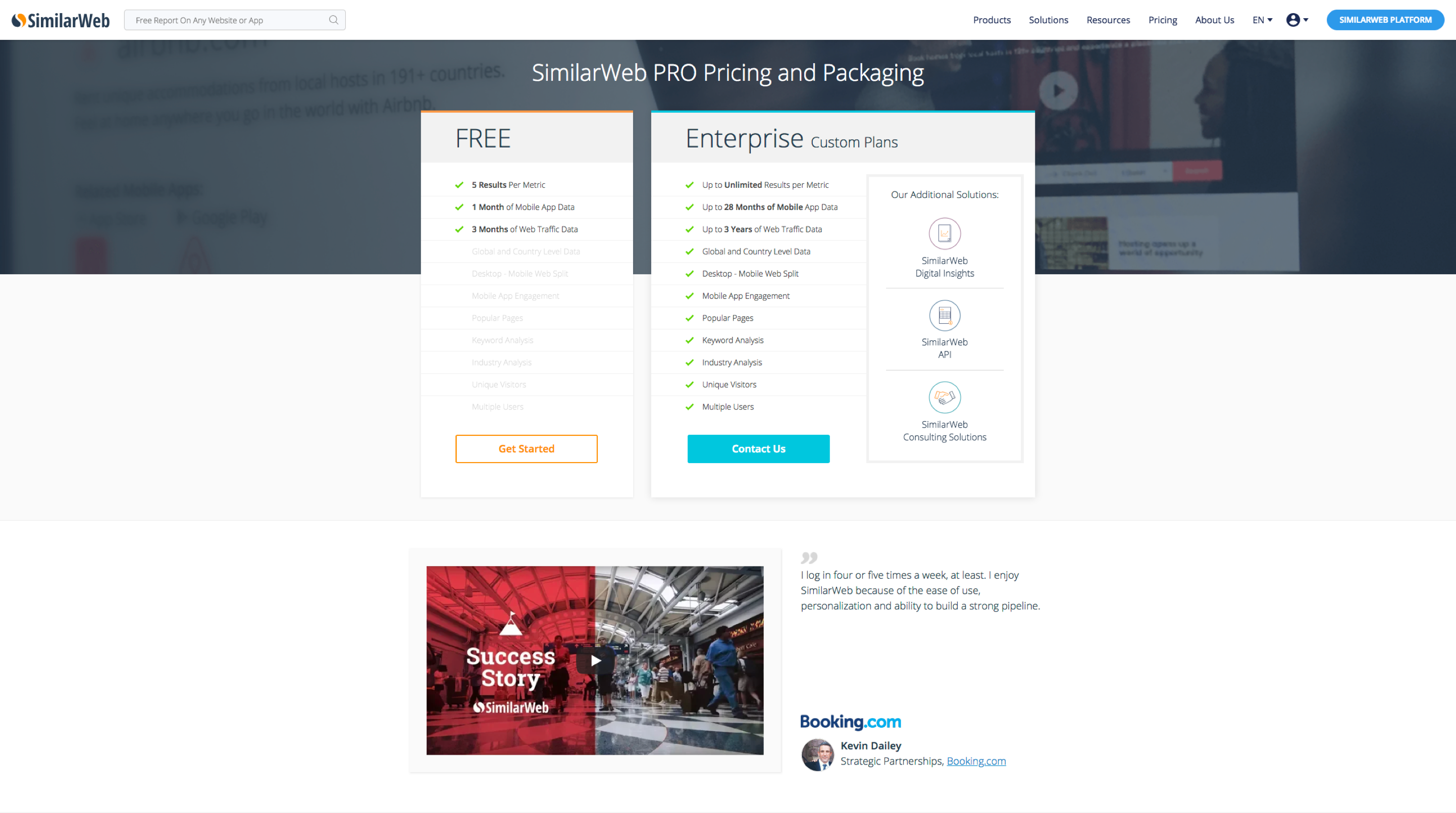
During 2019, Similarweb decided to turn its one-size-fits-all offering to a tailored solution-per persona-based product. This strategic change had a lot of Implications - one of them was changing pricing and packaging.
Deciding on the number of packages, the content of each offering and pricing them was a long complex process that evolved a lot of stakeholders. It seemed like it's going to take a few months to create requirements for a new updated pricing page on the corporate website.
As a product designer in the growth team I tried looking past this bottle neck and I started asking what can be done in the meanwhile in order to improve the existing pricing page’s performance.
Goals
- Increase CVR - Have more visitors click on the CTAs that lead them to schedule a meeting with our Go-To-Market team to discuss buying the product.
- Increase the number of MQL meetings scheduled - Having the visitors that clicked on the CTAs actually set in a meeting with our GTM team.
- Align the pricing page’s visual style to the rest of the corporate website.
I thought these important metrics can be improved by 'just' design and was excited to start testing my hypothesis!
Research
First, I talked with our support team to understand what are the frequently asked questions by visitors to the pricing page to try to identify possible frictions on their way to schedule a meeting and buy the product.
I found out that there’s lack of clarity with the prices themselves (it was a company decision not to show numbers) and some visitors weren’t sure which offer fits them and how these offers relate to what they read on the marketial material on the website.
Then, I wanted to understand what are the common patterns that users meet when visiting pricing pages for other products today. I looked at a lot of pricing pages - from companies that have similar offers, to companies that have completely different products but showed interesting approaches to pricing and packaging.
UX & Design
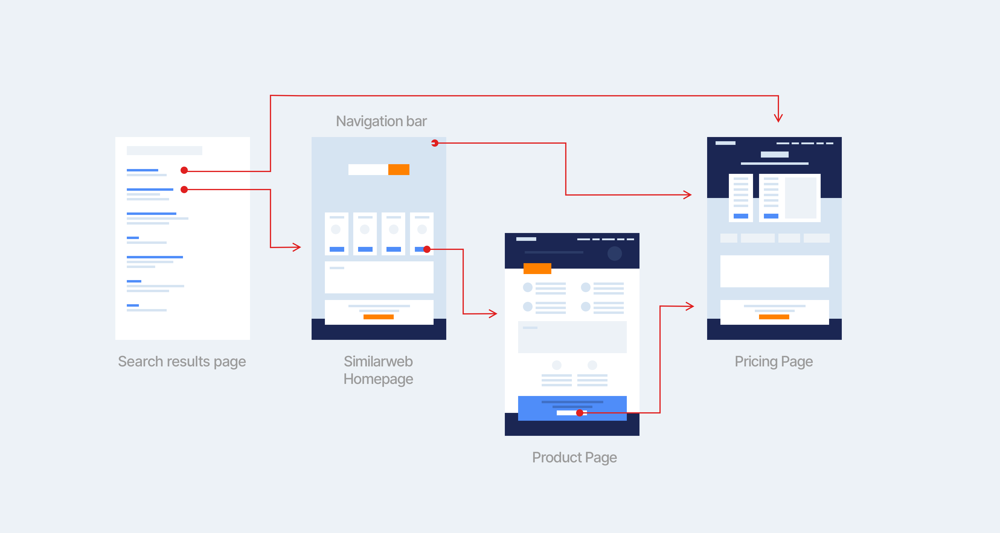
Equipped with insights and inspiration, I started creating user flows to map out all the ways our visitors are going through to get to the pricing page - may it be visiting the homepage and clicking on CTAs, feature pages or straight from google search results.
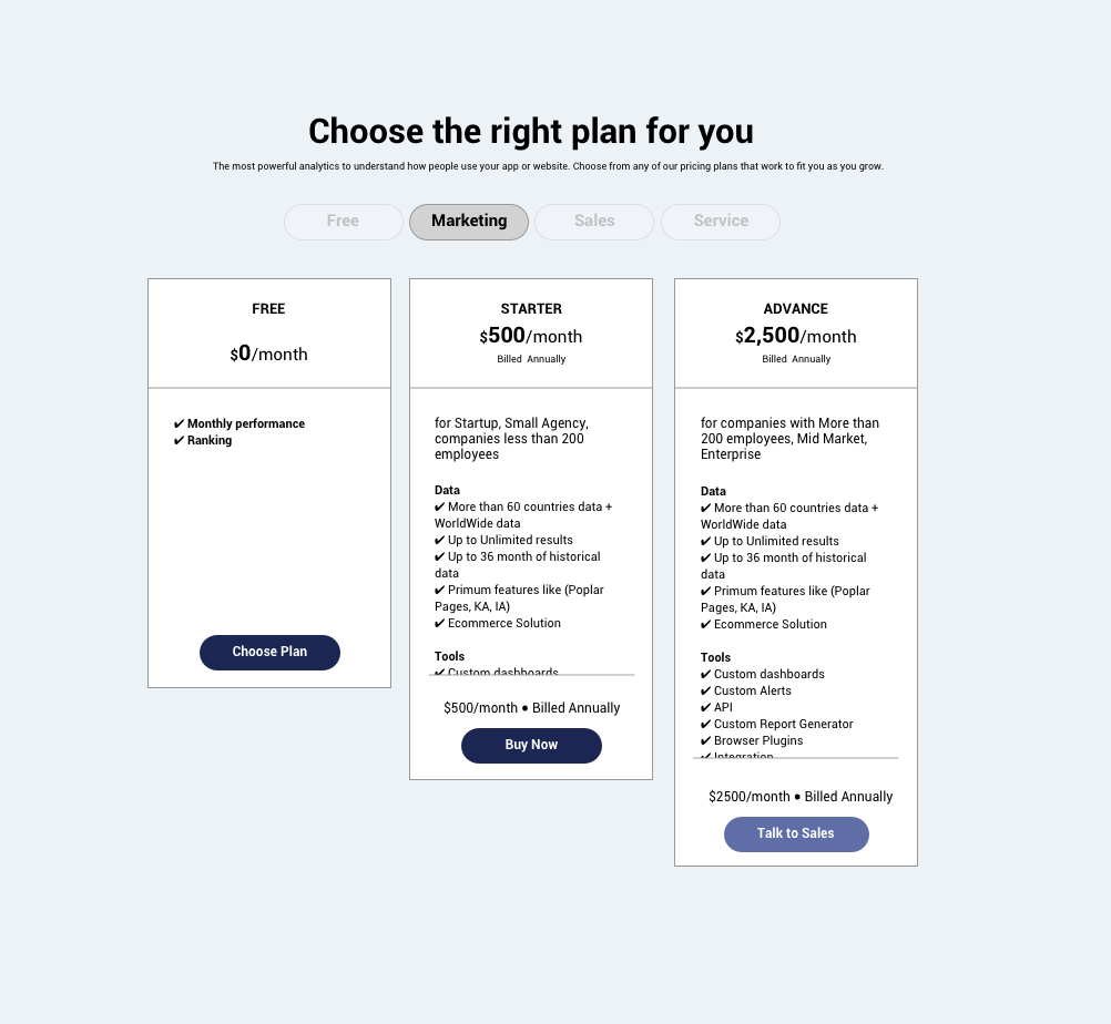
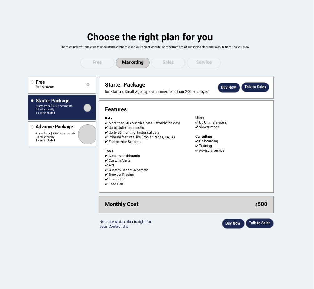
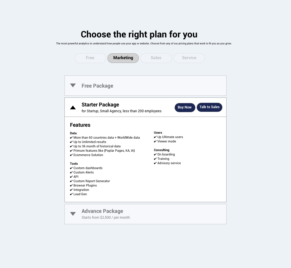
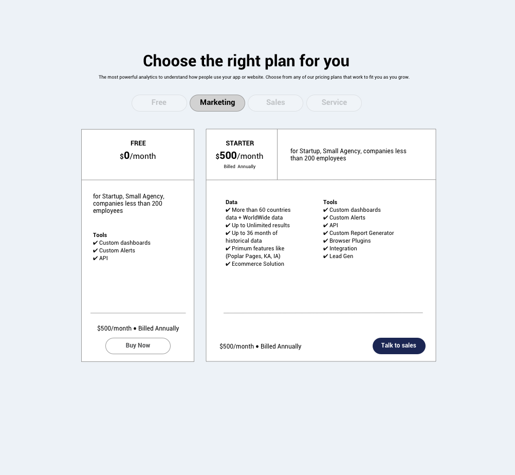
Then I sketched out possible layouts that can fit our needs, while keeping in mind that the design must be flexible enough to allow easy editing of the content, adding/removing of packages etc.
We decided to move forward with the layout that was a bit more similar to what we had, and agreed that once the copy is changed, we can a/b test alternative layouts.
UX improvements I wanted to test:
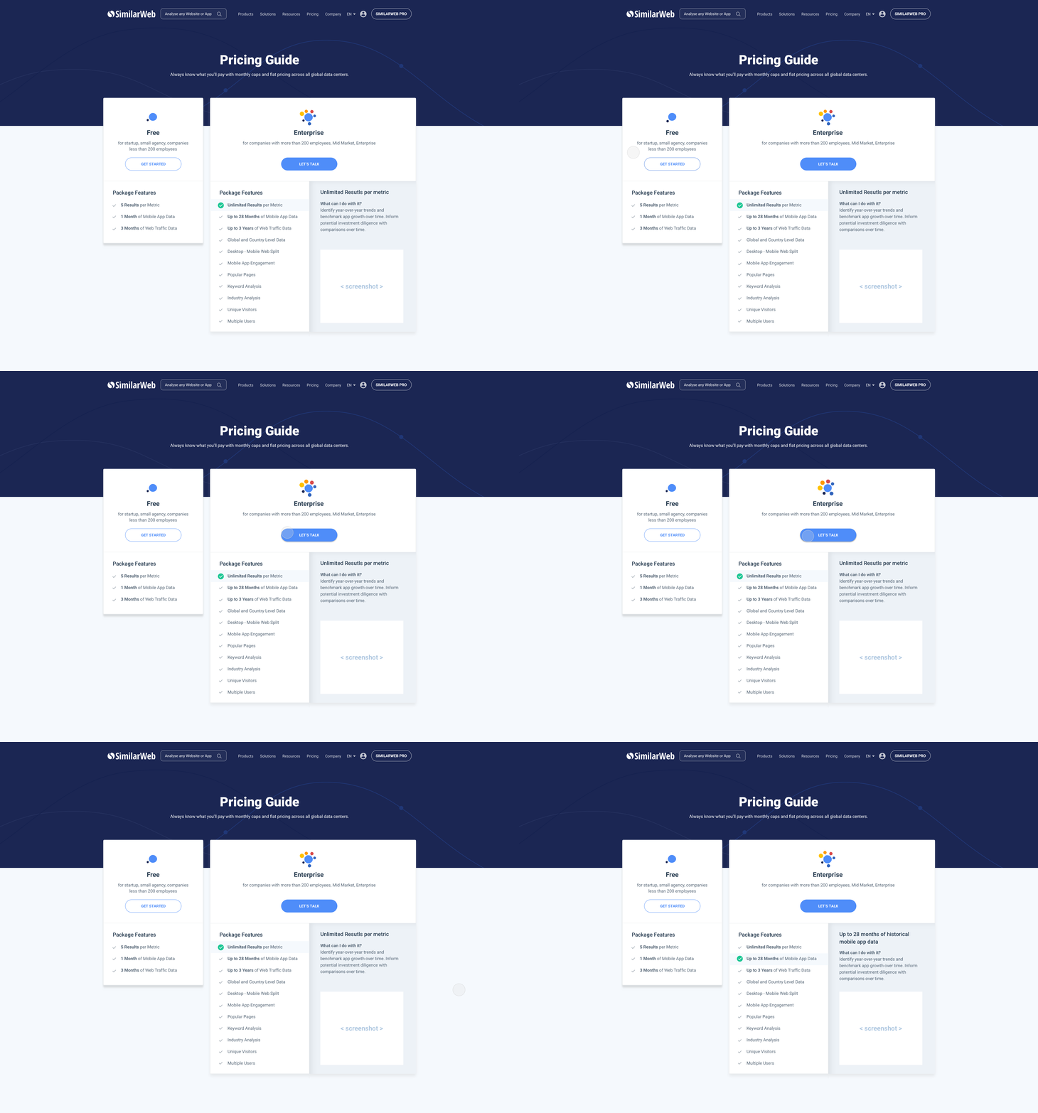
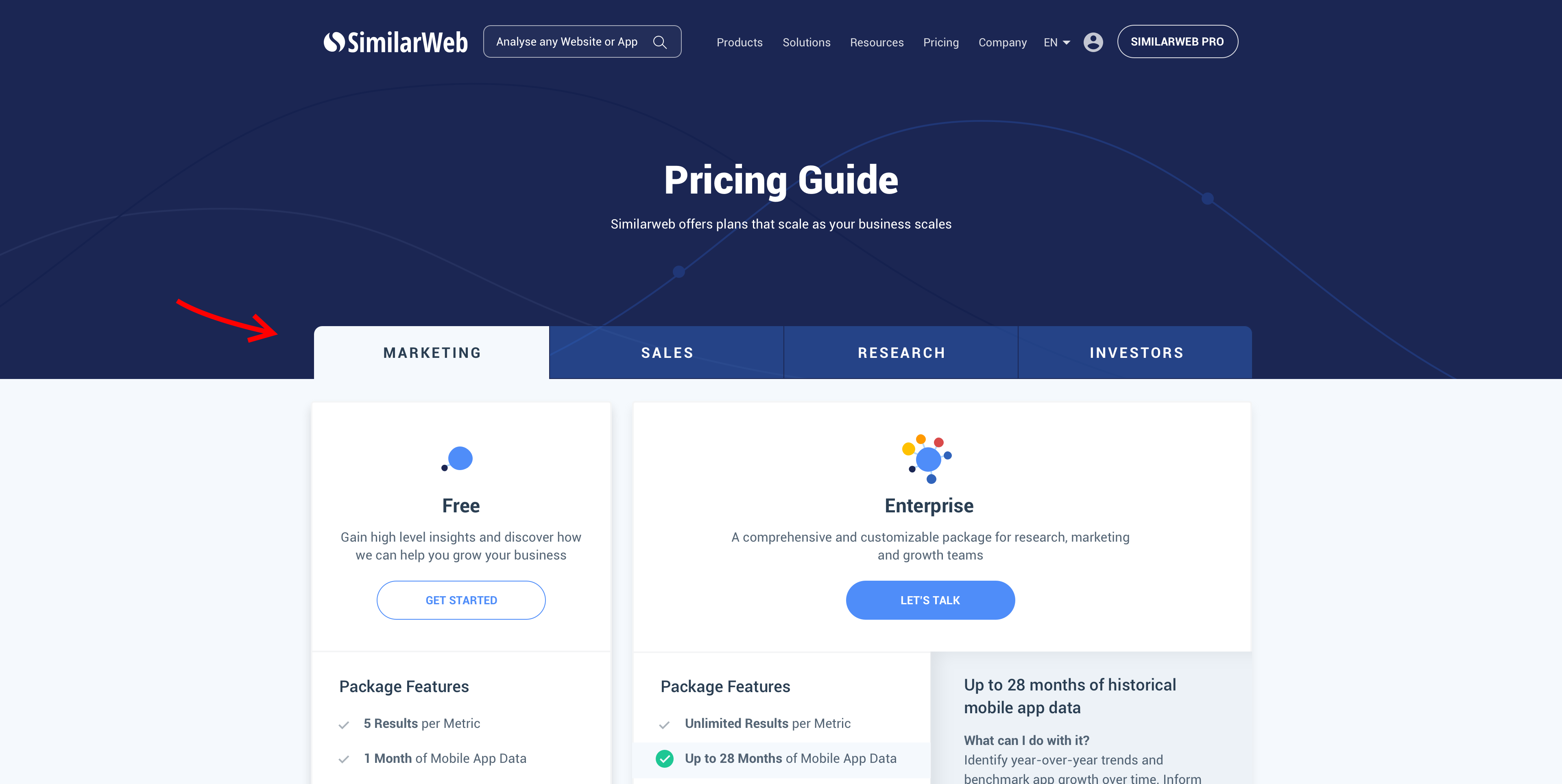
- I've placed the main CTA buttons "above the fold" and updated their look and feel to match all other buttons in the website (they feel more clickable when hovering over them with a micro interaction feedback).
- Added a descriptive text below each package title and under the main page title to better communicate to visitors what we are offering and for whom.
- Placed an additional CTA at the bottom of the page - "Not sure which plan fits your needs?" to address visitors who might feel confused as to which of the offerings to go with.
- Removed a section that was confusing to visitors in order to reduce noise, increase focus and enhance clarity about each element on the screen.
- Added page loading and hover animations to create a smooth user experience.
Delivery
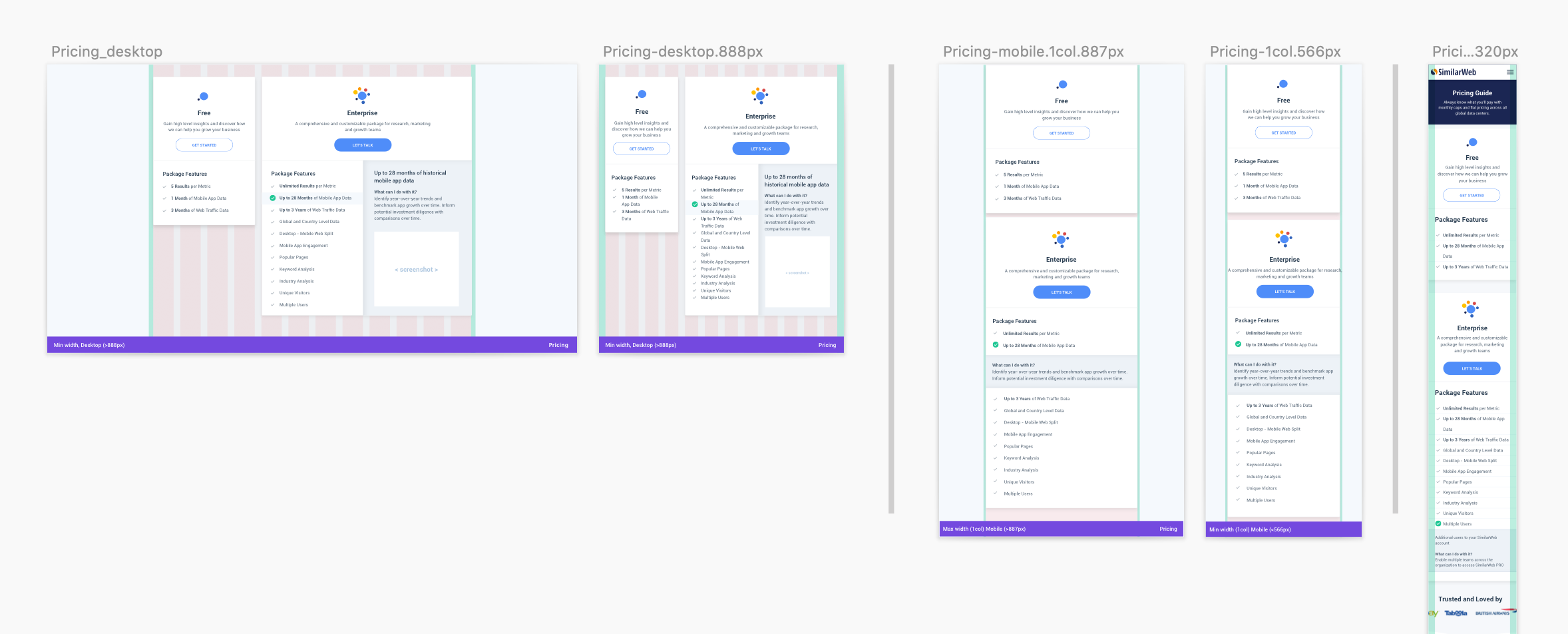
While redesigning, I knew that this page has to be flexible enough to accommodate future strategic decisions. I collaborated with the development team early in the process to ensure that we can restructure the wordpress template in a way that the content of the page can be easily modified once the product strategy changes, and there are multiple pricing packages. We created tabs that will stay hidden until all content and strategy is confirmed.
Results & Next steps
The newly designed page was released as part of an experiment vs. the original pricing page that showed that the new design performed significantly better than the old one -
16% Uplift in "Contact us" CVR and 70% Uplift in meetings CVR.
Making this pricing page clearer, more action-driven and trustworthy, had led this major increase in interest and hands raised.
This was the first step to building a scalable wordpress template that could accommodate new prices and packages. I envision this page to be easily modified by strategists and product managers to constantly validate for prices, copy or the features offered without the need of developers or designers.
See it live here.