⟵
Similarweb, 2019
The Color system
I created a fresh and accessible color system that supports Similiarweb’s UI and data visualization needs.
Audit
As a first step I conducted a color audit of all the components in the product, to get an idea of how colors have been used so far.
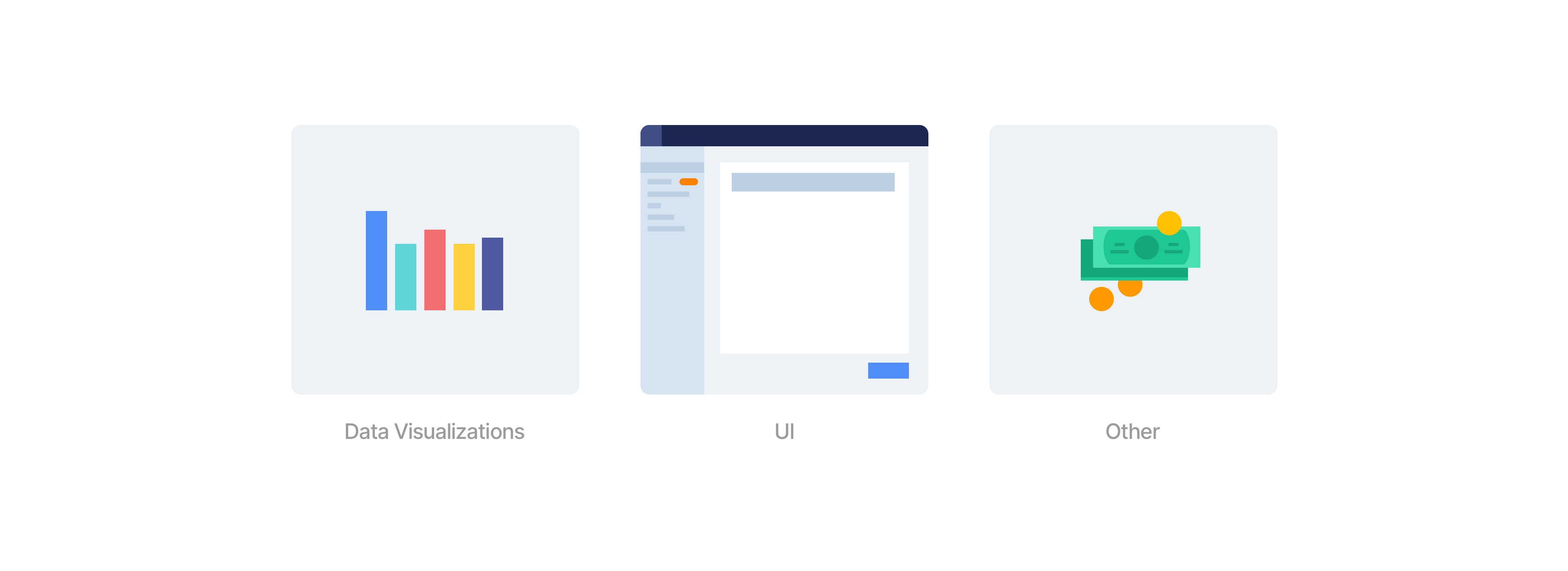
I found myself clustering colors into 3 main groups, and defined preliminary requirements for each one:
- Data Visualization - Colors that represent categories of data and are used in various chart types. These colors must be distinct and legible.
- UI - colors that appear in elements like buttons, typography, backgrounds, labels, etc. These colors should support information hierarchy in order to focus the user’s attention.
- Other - Colors that are used in product illustrations and marketing content. Since these assets have a wide range of uses, their colors can be more flexible.
My key insights from this audit:
- Inconsistent data visualizations - in screens that featured multiple charts, a category was often represented by one color in one chart, and then a different color in another chart, causing confusion.
- Duplicate and legacy colors - There were over 10 different shades of the same color across the product. Some features were using deprecated colors.
- Accessibility - many colors did not appear legible in color vision deficiency simulations. I then moved on to state the project’s goals:
Goals
- Increase legibility of data visualizations.
- Introduce vibrant colors that are consistent with Similarweb’s brand.
- Improve consistency by aligning to a single palette.
- support users with color vision deficiencies.
- Increase velocity of the design & engineering teams by establishing one source of truth.
Color Experimentation
I decided to tackle the data visualization color palette first since it was the most challenging. Similarweb’s data is usually displayed in one of 2 ways:
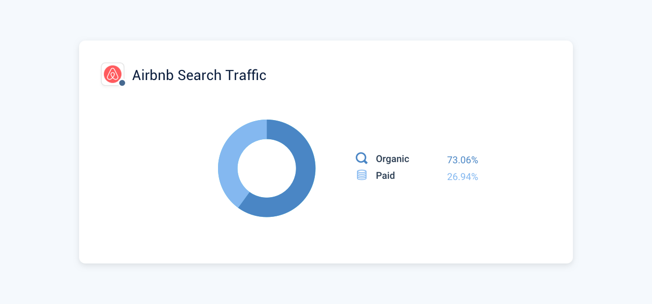
Comparing between categories in a single website
The system uses different tint levels of the same color.
Usually the comparison is between 2 categories, but some features include heat maps that utilize five tint levels of the same color.
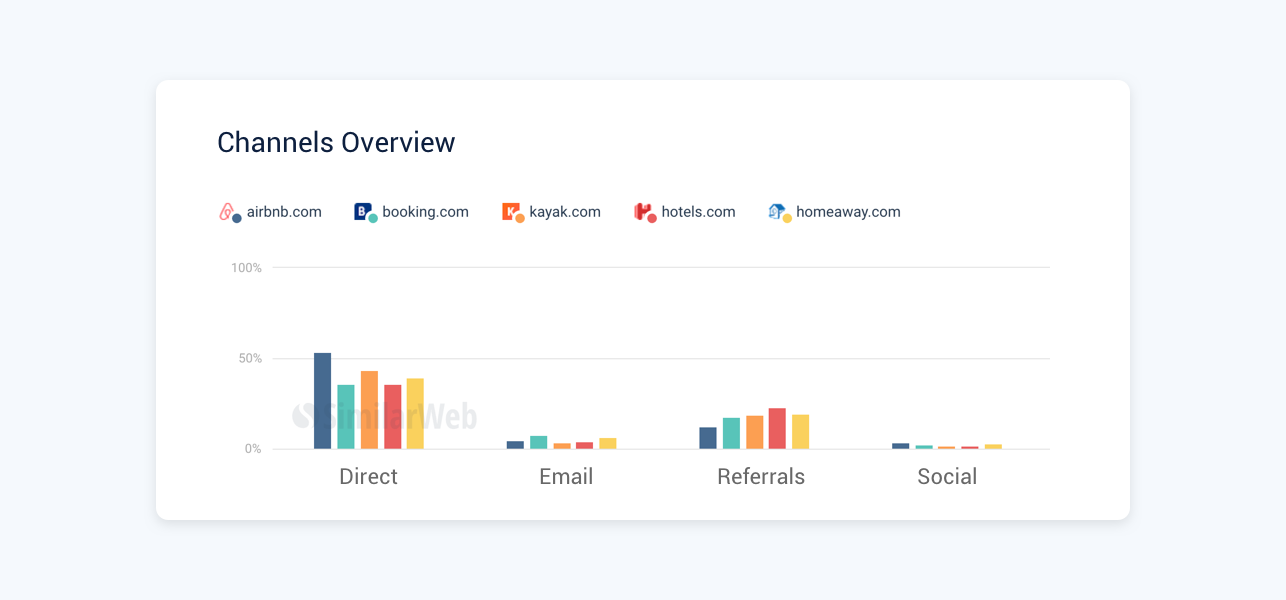
Comparing categories between competing websites
The system uses a different color for each competitor.
The max number of competitors that can be compared is 5, but in specific cases of visualizations there could be up to 10.
We decided to keep this logic since it steers users to associate hue with competitors and tint with categories, and promotes a sense of orientation throughout the product.

When choosing new colors I wanted to compliment Similarweb’s vibrant brand colors, and went towards the more saturated side of the palette. The main challenge was choosing 5 distinct colors that are different enough, while also accounting for 5 tint levels for each color.
I eliminated colors that did not pass legibility tests, and picked new shades that are more legible. Then, I tested a few optional palettes on charts in the product. I wanted to see if the new colors are clearer and also fit the product’s visual language.
When it came to naming the colors, I decided to adapt Material Design’s naming convention. Each color was given a name and included 5 weights to signify its tint levels.
The transition from a system based on unique names (e.g. light-medium-blue) to one based on numbers significantly improved the communication throughout the design team.

Expanding the palette
I aligned our UI colors to the new palette to ensure the interface is harmonious with the data visualizations. I expanded the grey palette to support a wider range of typography styles in the product.
I also needed to support positive and negative trend colors that are used extensively throughout the product. Since they need to function as legible indicators on top of the data, I separated them from the green and red tints, and included an independant saturated class.

implementation
The next step was mapping the existing colors in the product to the new palette, which required the attention of many stakeholders in the company. I facilitated sessions with members of the design, product and engineering teams, and presented them with ambiguous cases of color usage. For each case we asked the following questions:
- What does this color mean in this context?
- Have we seen a repeated use of this color before? if so, is the pattern clear and consistent across all uses? Does this make sense?
- Is the color implemented correctly? (is it the same or a similar color to what the designer intended?)
- How can we align it to the new color palette?
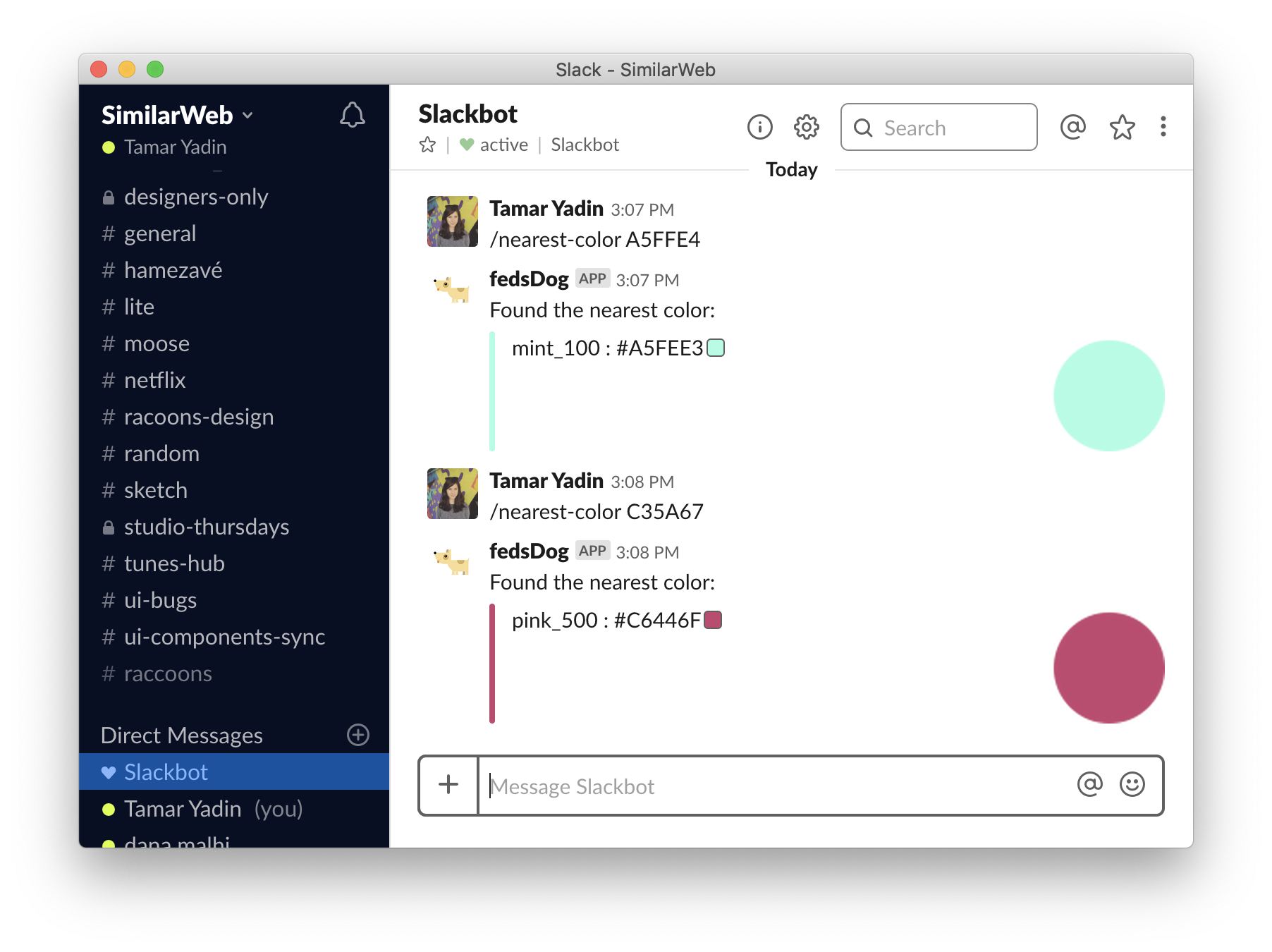
One of the benefits of having a cross functional team collaborating on the same problem, is that it opens it up to new, unexpected solutions. The amazing engineers I worked with created a slack bot that receives an input of any HEX color and answers with the nearest color from the new color palette. This tool made engineers more independent and the implementation much smoother.
Smart colors
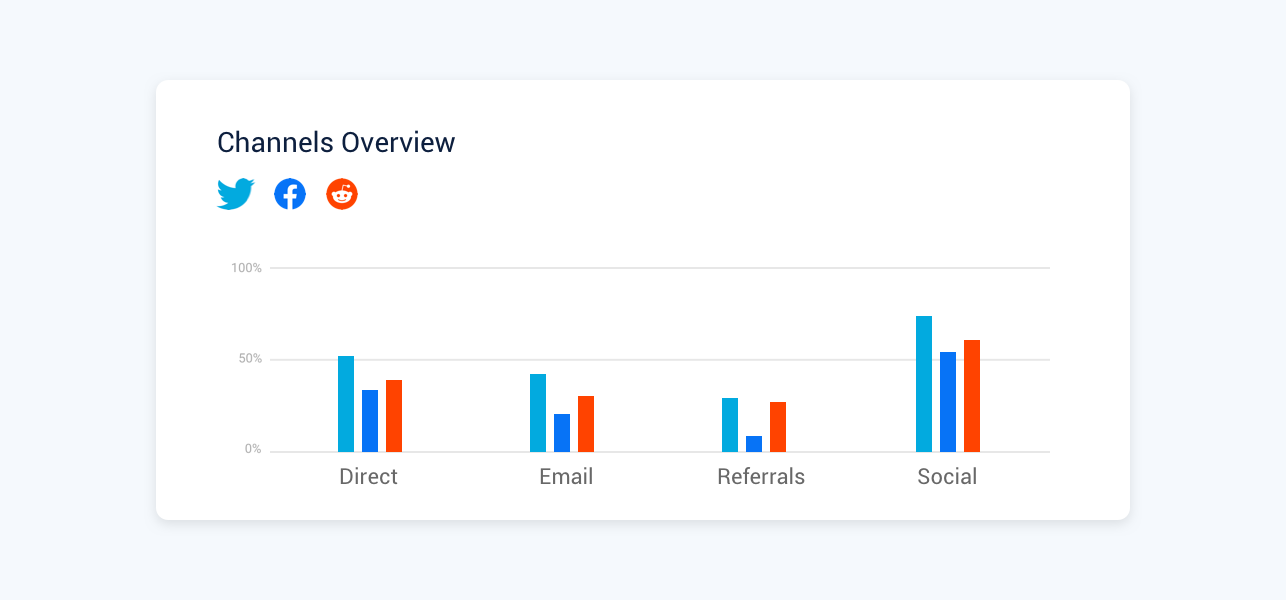
Another idea that arose during these sessions was to assign colors to competing brands based on their dominant brand color. This meant that in a graph that compares between Twitter, Facebook and reddit, Twitter would appear cyan, Facebook - blue, and reddit - orange.
For that to become a reality we needed to identify the brand’s dominant color. We could do that by sampling the website’s favicon and calculating the closest color to it from the new palette. After prototyping and testing this script on random brands we identified 2 main issues:
- This methodology worked for 80% of the websites, but fell short with brands that have more than one dominant main color. We tried prioritizing one color over another or assigning a random color instead, but eventually found it’s creating more confusion than clarity.
- Some colors bear a conventional meaning that can affect innocent comparisons. For example, a green and red line chart comparing spotify to youtube music can be read as positive vs. negative trends.
We decided to abandon this direction and revert back to random colors from the new palette.